
Since we first created our MASER workflow model for data-driven decision making during our LVNL project, we have successfully used it in several other projects. While traditional dashboards often just sit there without sparking action, our model guides you to think in active, step-by-step workflows. Below, I’ll share the key UX lessons and insights we’ve gathered along the way.
The pain of the 'dead' dashboard
The world is full of beautiful, yet lifeless dashboards. They show shiny graphs, pie charts, and real-time KPIs.
Often based on the idea “The more graphs on my dashboard, the better it is.” But as soon as you actually need to make a decision, everything grinds to a halt.
The pain of a traditional dashboard lies in its passivity. It is an information overload without any context. The data tells you something is wrong, but not why, or what the next step should be.
This leads to cognitive overload. You have to translate massive amounts of data into action all by yourself. Plus, these dashboards don't take your specific role or unique questions into account.
So you look at the dashboard, open another system to take action, and lose precious time and focus in the process.
In short, showing data is not the same as helping someone make a decision. Especially not in mission-critical environments where every second counts.
From data to workflow with the MASER model
To make data work for everyone, we at Okapion developed the MASER model. This UX framework shifts the mindset from 'how can we display everything?' to 'what decision does the user need to make right now?'.
MASER helps break down data-driven decision making into a logical, manageable workflow. The model guides the user through an interface following a clear cycle:
Monitoring and spotting a problem,
Analyzing the cause,
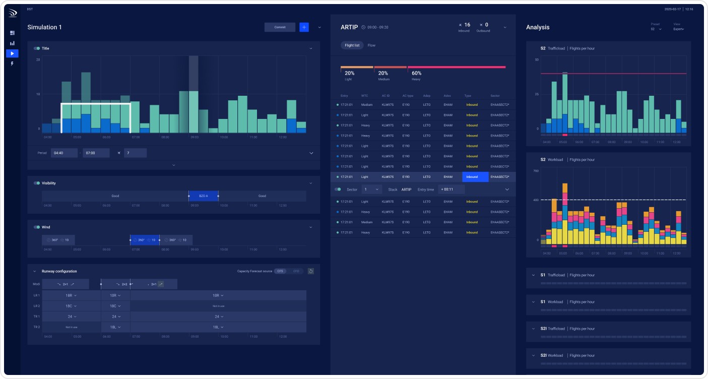
Simulating scenarios,
Executing the chosen best action,
Reporting what we learn from the choices made.
Using these steps, we design the perfect interface for each stage. We have successfully applied this model to several complex demand-capacity challenges, such as the planning software for Siemens Gamesa and Luchtverkeersleiding Nederland (Air Traffic Control the Netherlands).
What have been the results?
Thinking in workflows instead of dashboards has led to several great successes in these projects:
Faster and better decision-making Users no longer have to search for the meaning behind the numbers. The workflow suggests logical next steps and reduces 'noise' by keeping irrelevant data out of the interface at each step.
Fewer mistakes in high-stakes environments Whether it is airplanes, wind turbines, or ICU beds, the intuitive UI reduces mental pressure, drastically lowering the chance of human error. The ability to simulate scenarios without any real-world consequences is an incredibly powerful tool.
Higher adoption rates Users embrace the tools much faster because they fit their actual daily tasks. Some users rely on all five steps, while others get exactly what they need from just one or two interfaces designed for their specific tasks.
What were the challenges?
Innovation never happens without a little friction. While applying the MASER model, we also ran into some tricky challenges:
The temptation of 'wanting to see everything'. Stakeholders are often used to traditional dashboards and initially still want all available data on one screen. It takes strong UX leadership to filter down to the absolute essence of the workflow.
Backend complexity. A workflow that feels smooth to the user often requires connecting complex data sources and AI models behind the scenes. Translating that technical complexity into a simple UI is a constant learning process.
The human factor. When the system (with or without AI) simulates scenarios and suggests actions, the UX must always be transparent about why a certain recommendation will work. This is how you build trust. After all, in most cases, it is still the human who makes the final call.
Conclusion
Data only becomes valuable when you can understand it and take the right action. By moving away from dashboards and choosing a workflow-driven approach with our MASER model, we have turned complex data environments into intuitive, user-friendly applications. Whether in the air, in wind farms, or by the hospital bed.
Do you recognize the frustration of 'dead' dashboards within your organization? Let’s grab a coffee and talk about how we can turn your data into a smooth, effortless workflow.
